
HOW TO USE TRANSFORM PROPERTY IN CSS
Date posted :11/04/2019
In this tutorial we are going to see about how to use transform properties in CSS.
TRANSFORM ROTATION
<!DOCTYPE html>
<html>
<head>
<style>
div.first {
  width: 150px;
  height: 80px;
  background-color: Green;
  -ms-transform: rotate(20deg);
  -webkit-transform: rotate(100deg);
  transform: rotate(20deg);
}

div.second {
  width: 150px;
  height: 80px;
  background-color: yellow;
  -ms-transform: skewY(20deg);
  -webkit-transform: skewY(20deg);
  transform: skewY(20deg);
}

div.theird {
  width: 150px;
  height: 80px;
  background-color: black;
  -ms-transform: scaleY(1.5);
  -webkit-transform: scaleY(1.5);
  transform: scaleY(1.5);
}
</style>
</head>
<body>

<h1>How to use transform rotate property</h1>

<h2>Rotate property</h2>
Welcome
<br>

<h2>Skewy propertye</h2>
Welcome
<br>

<h2>scaleY property</h2>
Welcome

</body>
</html>
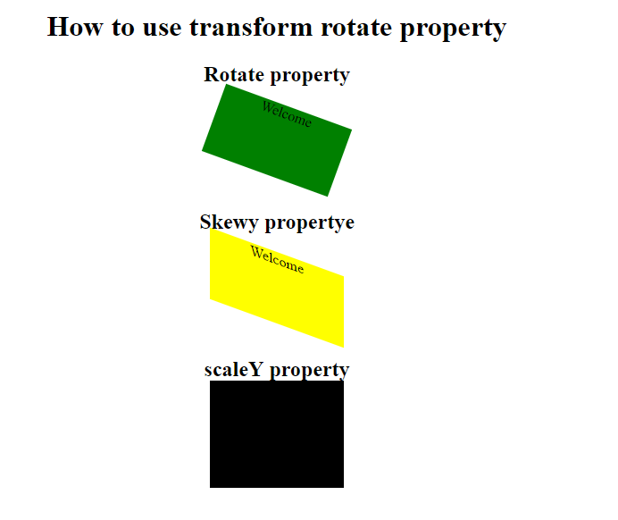
- The rotation created by rotate().
- If the values is positive, the movement will be clockwise . If negative, it will be counter-clockwise.
- The background color move based on our degree with in rotate.
DELAY PROPERTY
<!DOCTYPE html>
<html>
<head>
<style>
div {
  width: 100px;
  height: 100px;
  background: red;
  -webkit-transition-property: width;
  -webkit-transition-duration: 5s;
  -webkit-transition-delay: 2s;
  transition-property: width;
  transition-duration: 5s;
  transition-delay: 2s;
}

div:hover {
  width: 300px;
}
</style>
</head>
<body>

<h1>Delay Property</h1>


</body>
</html>
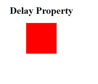
- When we hover into the div it will display the background color.
- The color display based on our given second.
- It will display until our duration second.
DURATION PROPERTY
<!DOCTYPE html>
<html>
<head>
<style>
div {
  width: 100px;
  height: 100px;
  background: red;
  -webkit-transition-property: width;
  -webkit-transition-duration: 5s;
  transition-property: width;
  transition-duration: 5s;
}

div:hover {
  width: 500px;
}
</style>
</head>
<body>
<center>
<h1>Duration</h1>

</center>


</body>
</html>
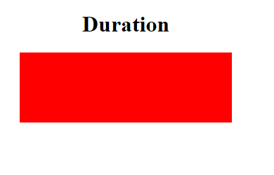
- The transition duration duration property is used to display the background for our required duration.
- Here the background color display based on our duration time.
- Based on above code it will display five second.
Thanks for using pheonixsolutions.
You find this tutorial helpful? Share with your friends to keep it alive.