How to Build a Design System in Figma Easily
Building a design system isn’t just about compiling UI elements—it’s about creating a shared language for your team, streamlining workflows, and ensuring consistency across your product. Here’s a beginner-friendly guide to crafting a design system in Figma step-by-step.
Why Build a Design System?
- What’s the objective? (e.g., improve onboarding, maintain visual consistency)
- Who’s using it? (designers, developers, content creators)
- What components repeat most often? (buttons, forms, typographic styles)
This helps you structure a system that adds value without getting bloated.

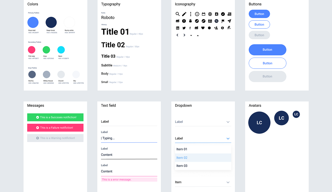
Build Your Foundations (Design Tokens)
- Color styles: primary, secondary, alerts, neutrals
- Typographic tokens: headings, body, captions
- Spacing guidelines: base spacing (like 8px/16px), consistent padding
Create Components
Start with core elements:
- Atoms: basic building blocks like buttons, inputs, icons
- Molecules → Organisms: combined elements such as cards, form layouts, navigation bars
Key features:
- Auto Layout: ensures components adapt automatically to size changes
- Variants: include component states like hover, active, disabled (e.g., Button → Primary → Hover)
Organize components into well-named categories to support scalability.
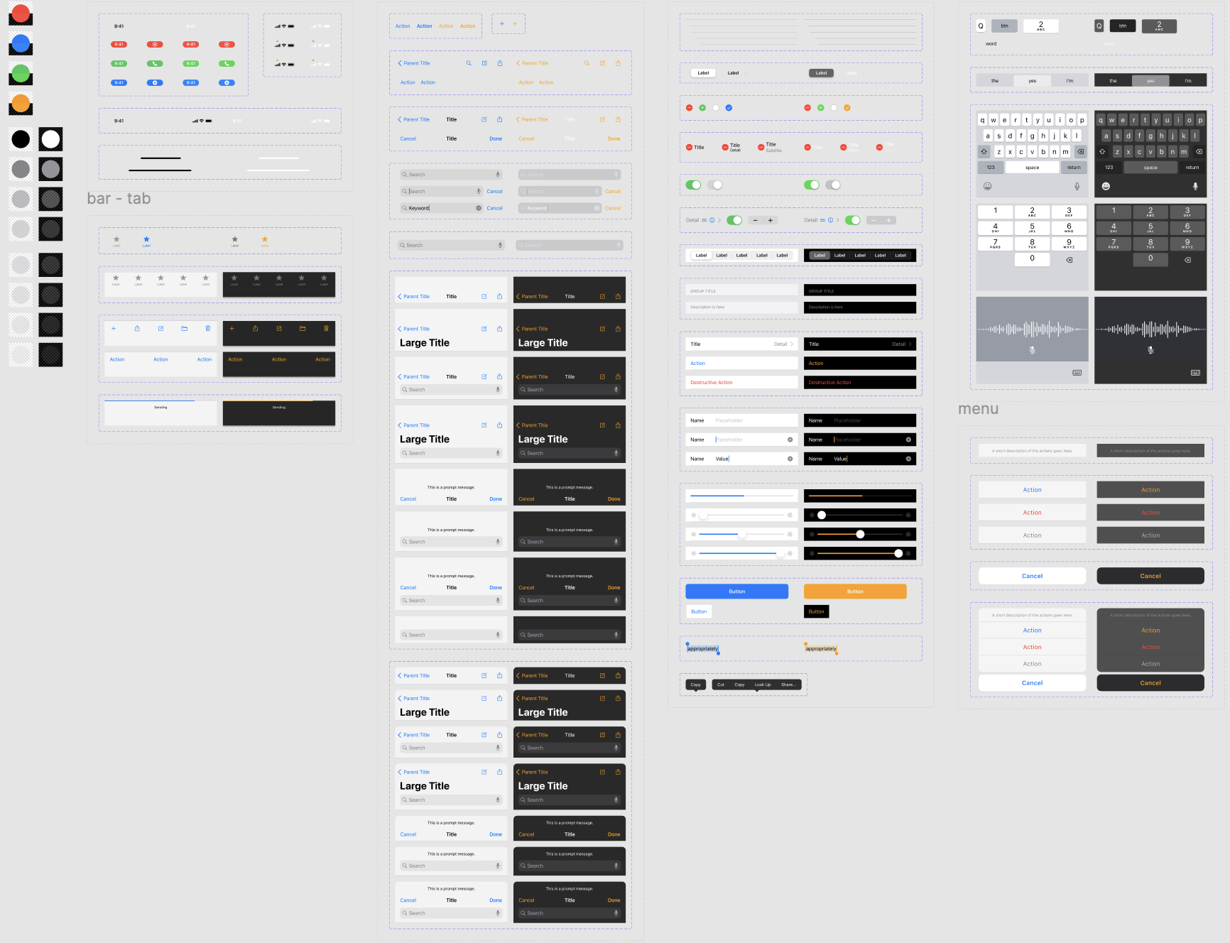
Organize & Document Within Figma
Group related elements into pages:
- Foundations: colors, typography, spacing
- Components: buttons, forms, navs
- Patterns: full layout or template usage
Add notes or example frames showing when and how to use each style or component—with dos and don’ts. This helps teammates and keeps everyone aligned.
Why Components Are Helpful in Design (Especially with Changes)
1. Single Source of Truth
When you create a component (e.g., a button), any update you make to the main/master component automatically reflects across all instances in your design. No need to update every screen manually.
2. Saves Time & Reduces Errors
If your product has 50 screens and you change the button style manually on each, it’s time-consuming and prone to mistakes. But with components — update once, done everywhere.
3. Consistency
Using components ensures design consistency. All buttons, cards, forms, etc., follow the same structure and rules — improving usability and visual harmony.
4. Scales Well
As your product grows, components make it easier to scale your design system. Add variants (hover, active, disabled) and manage them in one place.
5. Easy for Developer Handoff
Design systems with components are easier for developers to understand. They can map designs to reusable code components more easily.
Conclusion
A design system in Figma ensures consistency, saves time, and improves collaboration across teams. Start small with reusable components and grow it as your product evolves. It’s the key to building scalable, user-friendly designs efficiently.