Why UI Testing Saves Your App from Trust-Killing Visual Bugs
What Is UI Testing?
UI testing is not about making sure that pressing a button does something. It is about verifying that the button functions properly, and checking whether its design works on different devices (and structures including iPhone 16s or multi-purpose android tablets). UI Testing is UI verification which takes care of all the aspects including A/B buttons, frames, fonts, outlines, their consistency for multi-device compatibility and their visibility by all classes of people.
Types of testing, UI testing concentrates mostly disengaged areas therefore, it also focuses on:
1. Visual consistency:
Do the colors, fonts, and buttons match and translate over all screens?
2. Alignment and layout:
Have all elements been meticulously arranged and centered?
3. Responsiveness:
Is the program operated flawlessly on both 4-inch mobile and 12 inch tablet?
4. Accessibility:
Is the interface easy to use for people with unwanted disabilities?
Visual In UI Bugs That Can Break Your App:
Food delivery application can have types, visual bugs won’t break your app. Instead, they can give the app a sloppy look. Here are real-world examples UI testing can catch, with visuals to make them pop:
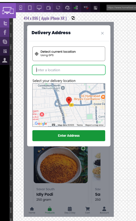
1] The Keyboard Coverup:
Scenario: On a food delivery application, while the user is checking out and attempts to enter a coupon code, the keyboard comes up but it completely obscures the input box. Users are forced to type without seeing anything, which ultimately leads to frustration and abandonment of their cart.
Why It Matters: This problem is a classic case of failing mobile testing hiding in plain sight. The bug can negatively impact user retention which is a key metric in measuring health of a mobile application.
Example: Keyboard hides coupon field on iPhone XR.
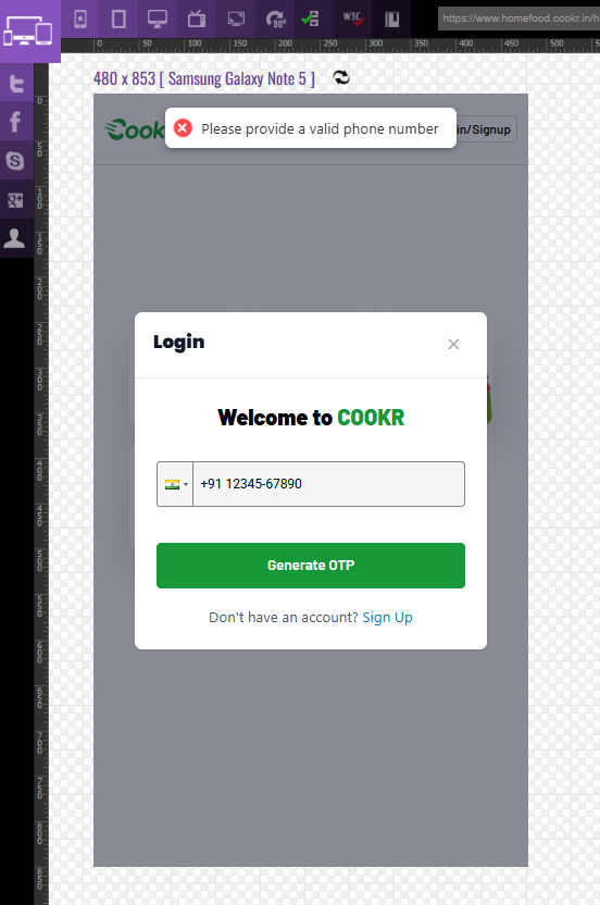
2] The Vanishing Error Message:
Scenario: A food delivery app shows an “Invalid PIN” error during login, but on a small Samsung screen (480 x 853), the message gets cut off at the edge. Users think the app froze and give up.
Why It Matters: Unreadable errors erode trust in critical apps like banking.
Example: Error message for login invalid input on Samsung Galaxy Note 5.
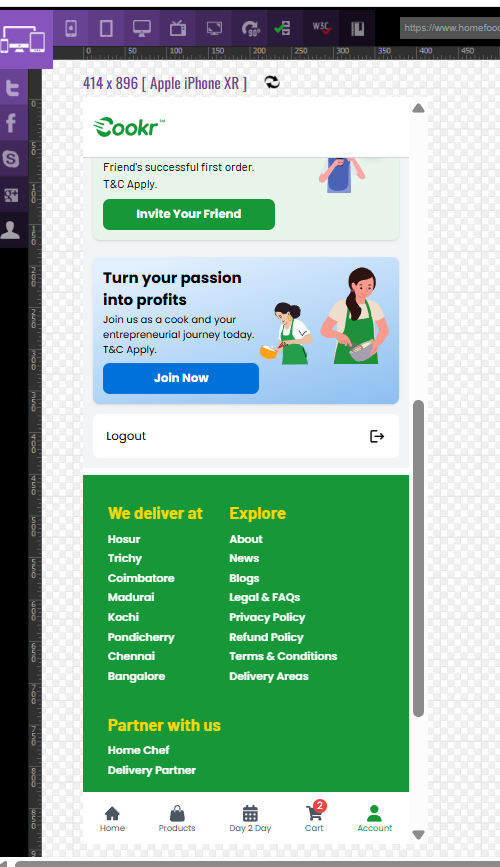
3] The Button Identity Crisis:
Scenario: A food delivery app has a green, rounded “Logout” button on the account but a white, square version on the profile page. Users hesitate, unsure which button is the primary action.
Why It Matters: Inconsistent styling confuses users and weakens brand trust.
Example: Button identify Logout button on Apple iPhone XR.
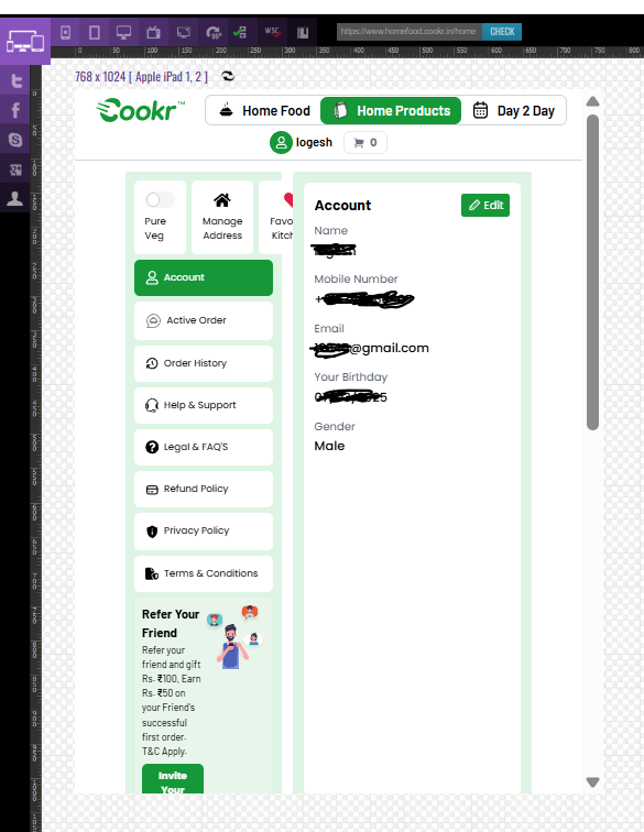
4] The Tablet Layout Meltdown:
Scenario: A food delivery app’s search form looks perfect on desktop, but on a 10-inch tablet (1024×768), labels overlap input fields, creating a chaotic mess. Users think the app is broken and bounce.
Why It Matters: Poor cross-device testing leads to lost users.
Example: Tablet looks like overlap from footer on Apple iPad 1, 2
How to Document UI Bugs in Testing
Catching a bug is only half the game-reporting it clearly gets it fixed fast. Here’s how to make your bug reports shine:
- Annotate screenshots:
Circle issues in tools like Snagit or Markup Hero. - Be precise:
Say “Logo is 15px too far left” instead of “It’s off.” - Context is key:
Note device, resolution, and browser (e.g., “Safari on iPad Air, 820×1180”). - Show the blueprint:
Link to Figma or Zeplin specs for the expected design. - Steps to reproduce:
Example: “Open menu on 360×640 Android, scroll, tap ‘Settings.’”
Manual vs Automated UI Testing:
Manual Testing
Pros:
- Ideal for catching visual quirks and UX issues
- Great for exploratory testing
Cons:
- Time-consuming
- Inconsistent if not well-documented
Visual Regression Testing (e.g., Percy, Applitools, Chromatic)
Pros:
- Detects pixel-level changes automatically
- Integrates with CI/CD pipelines
Cons:
- Can flag minor intended design tweaks as bugs
- Requires initial setup time
Best Approach: Use manual testing for new features and UX testing, then automate the rest with visual regression tools for build-to-build consistency.
Why UI Testing Is a Game-Changer:
- Builds trust – A clean UI builds confidence in your app
- Reinforces branding – Consistent look and feel matters
- Saves money – Fix issues before they reach production
- Improves accessibility – Everyone can use your app, regardless of ability
Challenges of UI Testing:
- Time-consuming when done manually across multiple devices
- Subjective if there are no defined design specs
- Ongoing maintenance as UI designs evolve
UI Testing Hacks to Save Time:
- Test on real devices (not just emulators)
- Check mobile and desktop layouts separately
- Sync regularly with designers
- Include UI tests in every sprint
- Don’t forget dark mode, transitions, and animations
Conclusion: UI Testing Is About More Than Looks – It’s About Earning Trust
UI testing isn’t just about making your app look good-it’s about making it feel dependable. A single off-center button or a hidden error message can leave users feeling frustrated and unsure about your app’s quality.
In a world where users have endless alternatives, first impressions matter. People expect apps to be clean, consistent, and easy to use. That’s why UI testing is no longer a “nice-to-have”—it’s a must.
Because in the end, UI testing isn’t just about pixels-it’s about building trust, one screen at a time.