CSS Layouts: Flexbox and Grid
Introduction:
In modern web page design, creating responsive web pages and visually appealing layouts is very important. The layout management options available to satisfy both these conditions are Flexbox and Grid layout. Even though both help to design pages effectively, they are used in different scenarios. This blog explains the differences between flexbox and grid.
Flexbox:
Flexbox is short form of flexible box. It is a one-dimensional layout model and control the alignments in a container. It can control either horizontally(row) or vertically(column).
Common Properties:
Container:
- display: flex – the layout of a container is controlled by this.
- flex-direction (row or column) – the contents are arranged based on this.
- flex-wrap: allows items to wrap onto multiple lines.
- justify-content: controls horizontal alignment
- align-items: controls vertical alignment
Items:
- flex: flex-grow, flex-shrink, flex-basis these properties are used to align the items.
- align-self: Overrides align-items for a specific item.
When can we use Flexbox?
- Align items either in a single row or column
- Distributing the space between items dynamically.
- Creating navigation bars, sidebars or card layouts.
Example:
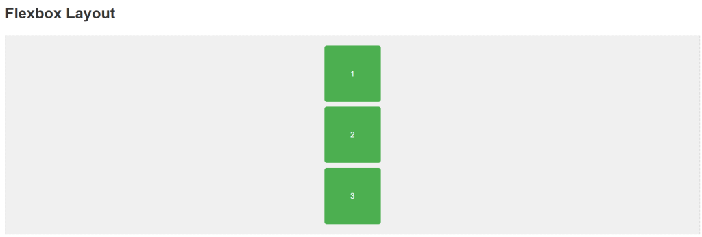
.flex-container {
display: flex;
flex-direction:column;
justify-content: space-around;
align-items: center;
gap: 10px;
padding: 20px;
border: 2px dashed #ddd;
}
.flex-item {
background-color: #4caf50;
color: white;
padding: 20px;
border-radius: 5px;
width: 80px;
height: 80px;
display: flex;
justify-content: center;
align-items: center;
}
<div class=”flex-container”>
<div class=”flex-item”>1</div>
<div class=”flex-item”>2</div>
<div class=”flex-item”>3</div>
</div>
Output:

Grid:
CSS Grid is a two-dimensional layout system that creates layouts involving rows and columns.
Common Grid properties
Container:
- display: grid or display: inline-grid – Align the container
- grid-template-rows or grid-template-columns : Define the structure
- gap: add space between rows and columns
- justify-items and align-items : Align items inside the cell.
Items:
- grid-column and grid-row: Control the span of an item across rows or columns.
- place-self: aligns an individual item.
When can we use Grid?
- Creating layouts with rows and columns
- Designing full page layout or complex structured layout like sidebar.
- Structuring forms and image galleries.
Grid Advantages:
- Precise control over layout
- Can easily create complex and responsive designs.
- Ability to overlap and layer grid items.
- Perfect for overall page layout.
Example:
.grid-container {
display: grid;
grid-template-columns: repeat(3, 1fr);
gap: 15px;
background-color: #e0e0e0;
padding: 20px;
border: 2px solid #ddd;
}
.grid-item {
background-color: #2196f3;
color: white;
padding: 20px;
border-radius: 5px;
display: flex;
justify-content: center;
align-items: center;
}
<h1>Grid Layout</h1>
<div class=”grid-container”>
<div class=”grid-item”>1</div>
<div class=”grid-item”>2</div>
<div class=”grid-item”>3</div>
<div class=”grid-item”>4</div>
<div class=”grid-item”>5</div>
<div class=”grid-item”>6</div>
</div>
Output:

Both layouts can be used combined also.
Conclusion:
Both Flexbox and Grid are tools used in modern CSS. If we understand the differences and choose the right tool to create layout ,we can easily create a responsive and stunning web page.
