
Post Date: February 07, 2019
Last Updated: October 09, 2026
Introduction
Scrollspy is a Bootstrap feature used to automatically update the active navigation links based on the user’s scroll position. It helps visitors identify which section of a webpage they are currently viewing.
In this tutorial, we will learn how to create a Scrollspy using Bootstrap 4 with a fixed navigation bar, multiple page sections, and a dropdown menu containing submenu links.
What Is Scrollspy?
Scrollspy automatically highlights the corresponding navigation link as the user scrolls through different sections of a webpage.
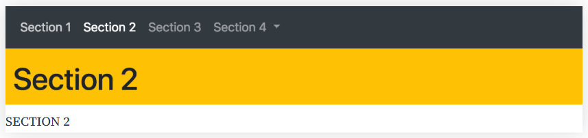
For example, a webpage may contain several sections, such as Section 1, Section 2, Section 3, and Section 4. When a user scrolls to a particular section, Scrollspy updates the navigation bar to indicate the active section.
This feature is useful for long webpages, documentation pages, tutorials, and websites with multiple content sections.
How to Create a Scrollspy Using Bootstrap 4
The following example demonstrates how to create a Scrollspy using Bootstrap 4. It includes:
- A fixed navigation bar.
- Multiple content sections.
- Active navigation links based on scroll position.
- A dropdown menu with submenu links.
- Different background colors for each section.
Step 1: Include the Required Dependencies
The example uses Bootstrap 4.2.1, jQuery 3.3.1, and Popper.js 1.14.6. Add the following dependencies to your HTML document’s <head> section.
<link rel="stylesheet" href="https://maxcdn.bootstrapcdn.com/bootstrap/4.2.1/css/bootstrap.min.css">
<script src="https://ajax.googleapis.com/ajax/libs/jquery/3.3.1/jquery.min.js"></script>
<script src="https://cdnjs.cloudflare.com/ajax/libs/popper.js/1.14.6/umd/popper.min.js"></script>
<script src="https://maxcdn.bootstrapcdn.com/bootstrap/4.2.1/js/bootstrap.min.js"></script>
These libraries provide the styling and JavaScript functionality required by the Bootstrap 4 Scrollspy example.
Step 2: Add the Scrollspy Configuration
Add the following CSS to ensure that the page uses relative positioning:
body {
    position: relative;
}
Then configure the <body> element with the Scrollspy attributes:
<body data-spy="scroll" data-target=".navbar" data-offset="50">
Here is what each attribute does:
data-spy="scroll"enables Scrollspy.data-target=".navbar"Connects Scrollspy to the navigation bar.data-offset="50"Sets a 50-pixel offset when determining the active section.
The offset can be adjusted according to the height of the fixed navigation bar and the desired activation point.
Step 3: Create the Navigation Bar
The navigation bar contains links to each page section. The dropdown menu provides links to Section 4’s two subsections.
Step 4: Add the Content Sections
Each section uses a unique id that matches the corresponding navigation link. This allows Bootstrap to associate the navigation items with the correct content sections.
Complete HTML Source Code
Copy the following code into an HTML file and open it in a browser to test the Scrollspy example.
<!DOCTYPE html>
<html lang="en">
<head>
  <title>Bootstrap Example</title>
  <meta charset="utf-8">
  <meta name="viewport" content="width=device-width, initial-scale=1">

  <link rel="stylesheet" href="https://maxcdn.bootstrapcdn.com/bootstrap/4.2.1/css/bootstrap.min.css">

  <script src="https://ajax.googleapis.com/ajax/libs/jquery/3.3.1/jquery.min.js"></script>
  <script src="https://cdnjs.cloudflare.com/ajax/libs/popper.js/1.14.6/umd/popper.min.js"></script>
  <script src="https://maxcdn.bootstrapcdn.com/bootstrap/4.2.1/js/bootstrap.min.js"></script>

  <style>
    body {
      position: relative;
    }
  </style>
</head>

<body data-spy="scroll" data-target=".navbar" data-offset="50">

<nav class="navbar navbar-expand-sm bg-dark navbar-dark fixed-top">
  <ul class="navbar-nav">
    <li class="nav-item">
      <a class="nav-link" href="#section1">Section 1</a>
    </li>

    <li class="nav-item">
      <a class="nav-link" href="#section2">Section 2</a>
    </li>

    <li class="nav-item">
      <a class="nav-link" href="#section3">Section 3</a>
    </li>

    <li class="nav-item dropdown">
      <a class="nav-link dropdown-toggle" href="#" id="navbardrop" data-toggle="dropdown">
        Section 4
      </a>

      <div class="dropdown-menu">
        <a class="dropdown-item" href="#section41">Link 1</a>
        <a class="dropdown-item" href="#section42">Link 2</a>
      </div>
    </li>
  </ul>
</nav>

<div id="section1" class="container-fluid bg-success" style="padding-top:70px;padding-bottom:70px">
  <h1>Section 1</h1>
  <p>NEVER EVER GIVE UP</p>
  <p>SURVIVAL $$$$$$$$</p>
</div>

<div id="section2" class="container-fluid bg-warning" style="padding-top:70px;padding-bottom:70px">
  <h1>Section 2</h1>
  <p>NATURE IS MOTHER OF GOD(())</p>
  <p>TRUE FRIENSHIP MAKES HAPPIER ^^^^^^^^^^2</p>
</div>

<div id="section3" class="container-fluid bg-secondary" style="padding-top:70px;padding-bottom:70px">
  <h1>Section 3</h1>
  <p>TRUE LOVE %%%%%%%%%%%%</p>
  <p>CREATIVITY ***************</p>
</div>

<div id="section41" class="container-fluid bg-danger" style="padding-top:70px;padding-bottom:70px">
  <h1>Section 4 Submenu 1</h1>
  <p>HURRAY$$$$$$$$$$$</p>
  <p>HAVE FUN ################</p>
</div>

<div id="section42" class="container-fluid bg-info" style="padding-top:70px;padding-bottom:70px">
  <h1>Section 4 Submenu 2</h1>
  <p>HELLO !!!!!!</p>
  <p>SUCCESS !!!!!!!!!!!!!!!!!</p>
</div>

</body>
</html>
Example Explained
1. Enable Scrollspy
Add data-spy="scroll" to the element that should be monitored while scrolling. In this example, the <body> element is used.
2. Connect Scrollspy to the Navigation Bar
The data-target attribute identifies the navigation bar that Scrollspy updates.
data-target=".navbar"
The .navbar selector connects the Scrollspy behavior to the navigation element with the navbar class.
3. Configure the Scroll Offset
The data-offset attribute specifies the number of pixels used as an offset when calculating the active section.
data-offset="50"
Adjust this value if navigation links become active too early or too late while scrolling.
4. Match Navigation Links to Section IDs
Each navigation link points to a corresponding section using its href attribute.
For example:
<a class="nav-link" href="#section1">Section 1</a>
The destination section uses the matching ID:
<div id="section1" class="container-fluid bg-success">
The same principle applies to section2, section3, section41, and section42.
5. Use Relative Positioning
The element being monitored by Scrollspy requires relative positioning. In this example, the CSS rule is applied to the body:
body {
    position: relative;
}
This is part of the configuration used by the original Bootstrap 4 implementation.
End Output and Results


Frequently Asked Questions
1. What is Bootstrap Scrollspy?
Bootstrap Scrollspy automatically updates the active navigation link according to the user’s scroll position on a webpage.
2. Why is data-target used in Scrollspy?
The data-target attribute specifies the navigation element that Bootstrap should update when the user scrolls through the page.
3. What is the purpose of data-offset?
The data-offset attribute adjusts the scroll position used to determine which navigation link should be active. It is particularly useful when a page has a fixed navigation bar.
Conclusion
Bootstrap 4 Scrollspy is a useful feature for creating interactive navigation on webpages with multiple content sections. By configuring the data-spy, data-target, and data-offset attributes and matching navigation links with section IDs, you can automatically highlight the active section while scrolling.
You can customize the navigation bar, section content, background colors, and scroll offset according to your website requirements.
Related Articles
- Testimonial Using Bootstrap
- How to Create a Section Counter Using Bootstrap 4
- Laravel Installation in VestaCP Account
Talk to Our Experts
Need help with Bootstrap development, responsive navigation, or frontend implementation? Our experts can help you find the right solution for your business.
Get in touch with us: Contact our team