
Post Date: May 16, 2026
Last Updated: October 23, 2026
Introduction
Bootstrap modals are pop-up dialogue boxes that display important information, forms, notifications, or other content on top of the current webpage. They help developers present additional information without navigating users away from the page.
A modal can be triggered by clicking a button or a link. For example, a student management application can use Bootstrap modals to display individual student details, while an e-commerce website can use them to show product information or confirm an order.
Bootstrap provides built-in modal functionality using HTML, CSS, and JavaScript, making it easier to create responsive popup windows with consistent styling.
In this tutorial, we will learn how to create Bootstrap modals using Bootstrap 3. The example demonstrates three buttons that display different student details in separate popup windows.
Prerequisites
Before implementing Bootstrap modals, ensure you have the following:
- Basic knowledge of HTML, CSS, and JavaScript.
- A text editor or IDE to create and edit HTML files.
- A web browser to test the implementation.
- Bootstrap 3.4.0 and a compatible version of jQuery.
Note: This tutorial uses Bootstrap 3 syntax to remain consistent with the original example. Bootstrap 3 is an older version; for new projects, consider using a currently supported version of Bootstrap.
Steps to Create Bootstrap Modals
Step 1: Include the Required Dependencies
First, create an HTML file and include the Bootstrap CSS stylesheet, jQuery library, and Bootstrap JavaScript file.
Bootstrap CSS provides the modal’s appearance, while jQuery and Bootstrap JavaScript handle the modal’s interactive behavior.
Step 2: Create the Buttons to Open the Modals
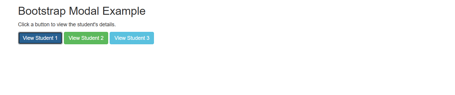
Create three buttons representing three students. Each button will open a corresponding modal when clicked.
The data-target attribute identifies the modal to display, while data-toggle=”modal” enables Bootstrap’s modal functionality.
Step 3: Define the Modal Structure
Each modal contains three main sections:
- Modal header: Displays the title and a close button.
- Modal body: Contains the student information.
- Modal footer: Contains actions such as the Close button.
Each modal must have a unique ID so that the corresponding button can open the correct popup.
Step 4: Add Student Details
Inside each modal body, create a table containing the student’s serial number, name, and city.
For this example, we will display different sample student records in each modal.
Step 5: Run and Test the Example
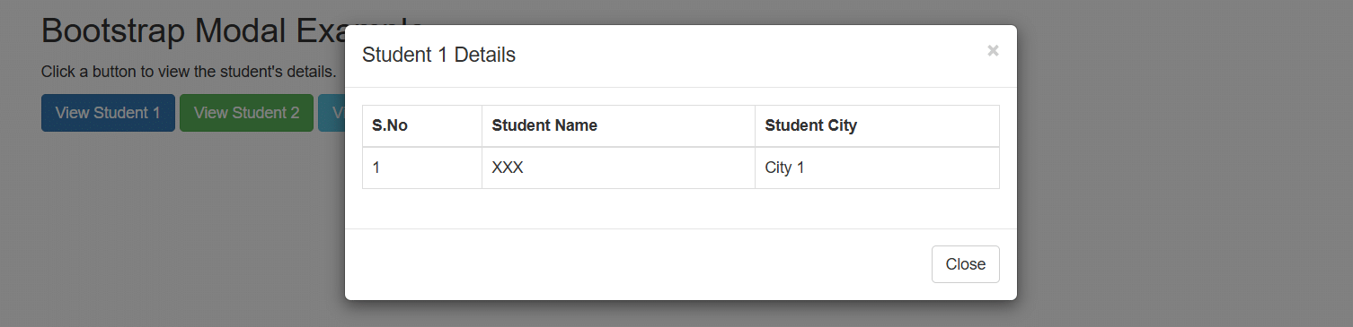
Save the HTML file and open it in your browser. Click each student button to verify that the appropriate modal appears.
The modal can be closed using the Close button, the close icon in the header, or the backdrop when backdrop dismissal is enabled.
Complete HTML Source Code
The following example combines the required dependencies, three trigger buttons, and three modal windows into one HTML file.
<!DOCTYPE html>
<html lang="en">
<head>
<meta charset="UTF-8">
<meta name="viewport" content="width=device-width, initial-scale=1.0">
<title>Bootstrap Modal Example</title>
<link
rel="stylesheet"
href="https://maxcdn.bootstrapcdn.com/bootstrap/3.4.0/css/bootstrap.min.css"
>
<script src="https://ajax.googleapis.com/ajax/libs/jquery/3.4.0/jquery.min.js"></script>
<script src="https://maxcdn.bootstrapcdn.com/bootstrap/3.4.0/js/bootstrap.min.js"></script>
</head>
<body>
<div class="container">
<h2>Bootstrap Modal Example</h2>
<p>Click a button to view the student's details.</p>
<button type="button"
class="btn btn-primary"
data-toggle="modal"
data-target="#student1">
View Student 1
</button>
<button type="button"
class="btn btn-success"
data-toggle="modal"
data-target="#student2">
View Student 2
</button>
<button type="button"
class="btn btn-info"
data-toggle="modal"
data-target="#student3">
View Student 3
</button>
</div>
<!-- Student 1 Modal -->
<div class="modal fade"
id="student1"
tabindex="-1"
role="dialog"
aria-labelledby="student1Title">
<div class="modal-dialog" role="document">
<div class="modal-content">
<div class="modal-header">
<button type="button"
class="close"
data-dismiss="modal"
aria-label="Close">
<span aria-hidden="true">×</span>
</button>
<h4 class="modal-title" id="student1Title">
Student 1 Details
</h4>
</div>
<div class="modal-body">
<table class="table table-bordered">
<thead>
<tr>
<th>S.No</th>
<th>Student Name</th>
<th>Student City</th>
</tr>
</thead>
<tbody>
<tr>
<td>1</td>
<td>XXX</td>
<td>City 1</td>
</tr>
</tbody>
</table>
</div>
<div class="modal-footer">
<button type="button"
class="btn btn-default"
data-dismiss="modal">
Close
</button>
</div>
</div>
</div>
</div>
<!-- Student 2 Modal -->
<div class="modal fade"
id="student2"
tabindex="-1"
role="dialog"
aria-labelledby="student2Title">
<div class="modal-dialog" role="document">
<div class="modal-content">
<div class="modal-header">
<button type="button"
class="close"
data-dismiss="modal"
aria-label="Close">
<span aria-hidden="true">×</span>
</button>
<h4 class="modal-title" id="student2Title">
Student 2 Details
</h4>
</div>
<div class="modal-body">
<table class="table table-bordered">
<thead>
<tr>
<th>S.No</th>
<th>Student Name</th>
<th>Student City</th>
</tr>
</thead>
<tbody>
<tr>
<td>2</td>
<td>YYY</td>
<td>City 2</td>
</tr>
</tbody>
</table>
</div>
<div class="modal-footer">
<button type="button"
class="btn btn-default"
data-dismiss="modal">
Close
</button>
</div>
</div>
</div>
</div>
<!-- Student 3 Modal -->
<div class="modal fade"
id="student3"
tabindex="-1"
role="dialog"
aria-labelledby="student3Title">
<div class="modal-dialog" role="document">
<div class="modal-content">
<div class="modal-header">
<button type="button"
class="close"
data-dismiss="modal"
aria-label="Close">
<span aria-hidden="true">×</span>
</button>
<h4 class="modal-title" id="student3Title">
Student 3 Details
</h4>
</div>
<div class="modal-body">
<table class="table table-bordered">
<thead>
<tr>
<th>S.No</th>
<th>Student Name</th>
<th>Student City</th>
</tr>
</thead>
<tbody>
<tr>
<td>3</td>
<td>ZZZ</td>
<td>City 3</td>
</tr>
</tbody>
</table>
</div>
<div class="modal-footer">
<button type="button"
class="btn btn-default"
data-dismiss="modal">
Close
</button>
</div>
</div>
</div>
</div>
</body>
</html>
Output
Example Explained
1. Bootstrap and jQuery Dependencies
The example loads the Bootstrap stylesheet for modal styling and the jQuery and Bootstrap JavaScript files for interactive behavior. Ensure the libraries load successfully before testing the modal functionality.
2. Modal Trigger Buttons
The data-toggle=”modal” attribute tells Bootstrap that the button opens a modal. The data-target attribute points to the ID of the corresponding modal.
For example, the first button targets the element with the ID student1.
3. Modal Container
The modal uses the modal class as its outer container. The modal-dialog and modal-content classes define the dialog layout and its content.
The fade class adds a transition effect when the modal opens or closes.
4. Modal Header, Body, and Footer
The header displays the title and close icon. The body contains the student table, and the footer provides a Close button.
The data-dismiss=”modal” attribute allows a button to close the active modal.
5. Unique Modal IDs
Each modal has a unique ID: student1, student2, or student3. Matching each button’s data-target to the correct modal ID ensures the expected student information appears.
Benefits of Using Bootstrap Modals
- Improved user experience: Display additional information without leaving the current page.
- Reusable interface elements: Use modals for student details, forms, notifications, and confirmation messages.
- Consistent styling: Bootstrap provides predefined classes for modal layouts and buttons.
- Responsive presentation: Bootstrap modals adapt to different viewport sizes, with additional adjustments possible when needed.
- Simple implementation: Data attributes provide a convenient way to open and close modals without writing a separate click handler for every button.
Best Practices for Bootstrap Modals
- Give each modal a unique ID and a descriptive title.
- Keep modal content concise and relevant to the action.
- Use clear labels for buttons and provide accessible names for close controls.
- Test the layout on mobile devices and with keyboard navigation.
- Avoid opening multiple modal windows simultaneously.
- Use supported framework versions for new projects and follow the corresponding version’s documentation.
Frequently Asked Questions
1. What is a Bootstrap modal?
A Bootstrap modal is a popup dialog displayed over a webpage. It can contain information, forms, notifications, or interactive controls without requiring the user to navigate to another page.
2. How do you open a Bootstrap 3 modal?
Add data-toggle=”modal” and data-target=”#modalID” to a button or link. The target must match the ID of the modal element.
3. How do you close a Bootstrap modal?
Use data-dismiss=”modal” on a close button. By default, users can also dismiss a modal by clicking its backdrop or pressing Escape, unless those behaviors have been disabled.
Conclusion
Bootstrap modals provide a convenient way to display additional information without redirecting users to another page. By including the required dependencies, defining unique modal IDs, and connecting buttons to their respective modal windows, developers can create interactive popup dialogs with minimal code.
The student-details example demonstrates how multiple modals can be used within the same webpage. You can adapt the same structure for registration forms, confirmation messages, product details, and other application requirements.
Related Articles
- Bootstrap 4 Scrollspy — Learn how to highlight navigation links automatically as users scroll through different sections of a webpage.
Official Documentation
Talk to Our Experts
Need help building responsive web interfaces or implementing interactive Bootstrap components? Our team can help you develop reliable, user-friendly web applications tailored to your business requirements.
Contact our experts to discuss your project.