The Foundations of Good UI Design: Hierarchy, Color, Typography, and Space
Introduction
Great UI design rarely comes from a single clever idea — it comes from mastering a handful of fundamentals and applying them consistently. Visual hierarchy, color, typography, and white space aren’t separate skills; they work together to guide the user’s eye, communicate meaning, and create interfaces that feel effortless to use.
This article walks through five foundational principles every UI designer should internalize: visual hierarchy, color theory, typography, white space, and the “3 C’s” — contrast, consistency, and clarity.
1. Visual Hierarchy: Guiding the Eye on Purpose
Visual hierarchy is the arrangement of elements in a way that signals their order of importance. Without it, users are left to guess where to look first — and most won’t bother guessing for long.
Key techniques for establishing hierarchy:
- Size – Larger elements draw attention first. Headlines should be visibly larger than body text.
- Position – Elements placed higher on a screen, or aligned with natural reading patterns (left-to-right, top-to-bottom, or F-pattern/Z-pattern layouts), get noticed first.
- Weight and contrast – Bold text or high-contrast elements stand out against lighter, thinner ones.
- Proximity and grouping – Related elements placed close together are perceived as a single unit, reducing cognitive load.
A simple test: squint at your design, or blur it slightly. If you can still tell what the primary action is, your hierarchy is working.

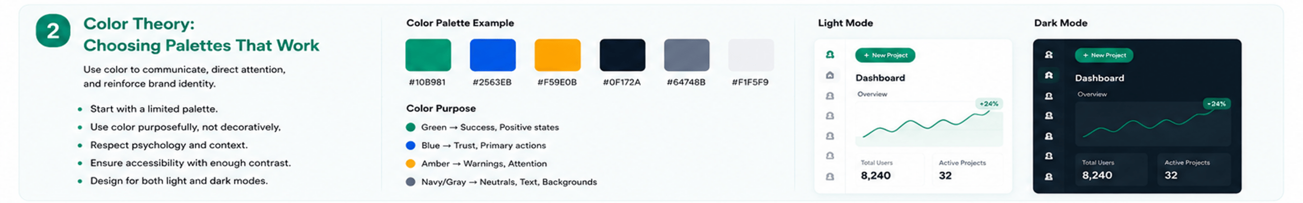
2. Color Theory: Choosing Palettes That Work
Color isn’t decoration — it’s communication. It signals state (success, error, warning), reinforces brand identity, and directs attention to what matters most.
Practical guidelines:
- Start with a limited palette. One primary brand color, one or two accent colors, and a neutral scale (grays) for backgrounds and text is usually enough.
- Use color purposefully, not decoratively. Reserve your most saturated accent color for primary actions (buttons, links) so it retains meaning.
- Respect color psychology, but don’t over-rely on it. Blue often reads as trustworthy, red as urgent — but cultural context and brand consistency matter more than universal “rules.”
- Always test for accessibility. Text-to-background contrast should meet WCAG AA standards (4.5:1 for normal text) at minimum.
- Design for dark and light modes independently. A color that works on a white background may lose contrast or feel harsh on a dark one — don’t just invert values.
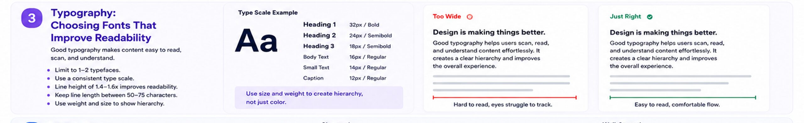
3. Typography: Choosing Fonts That Improve Readability
Typography does the heavy lifting in most interfaces — it’s how the majority of information is actually communicated. Poor typography makes even a beautifully colored, well-structured screen hard to use.
Core principles:
- Limit yourself to 1–2 typefaces. One for headings, one for body text (or a single versatile family with multiple weights) keeps things cohesive.
- Establish a type scale. Define consistent sizes for headings, subheadings, body text, and captions rather than picking sizes ad hoc.
- Line height matters as much as font size. A line height of 1.4–1.6x the font size generally improves readability for body text.
- Watch line length. Around 50–75 characters per line is the sweet spot for comfortable reading — too wide, and the eye struggles to track back to the next line.
- Use weight and size to reinforce hierarchy, not just color — this also improves accessibility for colorblind users.
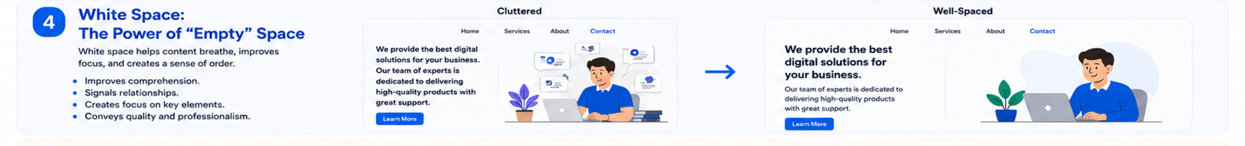
4. White Space: The Power of “Empty” Space
White space (or negative space) is often the most underused tool in a designer’s kit — precisely because it’s invisible when done well. It’s not wasted space; it’s what gives your content room to breathe and be understood.
Why it matters:
- Improves comprehension – Adequate spacing between elements helps users parse information faster and with less effort.
- Signals relationships – Space (or lack of it) between elements tells users what’s grouped together and what’s separate, often more effectively than borders or dividers.
- Creates focus – Generous space around a key element (like a CTA button) naturally draws the eye to it.
- Conveys quality – Cramped interfaces often feel cheap or overwhelming; well-spaced ones feel premium and considered.
A useful habit: after finalizing a layout, try increasing padding and margins by 20–30%. Interfaces almost always benefit from more breathing room than designers initially give them.
5. The 3 C’s: Contrast, Consistency, and Clarity
These three principles act as a final quality check across everything above.
Contrast
Ensures elements are distinguishable — in color, size, and weight — so users can quickly tell what’s interactive, what’s informational, and what’s most important.
Consistency
Similar elements should look and behave the same way throughout a product. A button that looks one way on one screen and different on another erodes trust and increases cognitive load. This is where design systems and component libraries earn their value.
Clarity
Every screen should answer, at a glance: What is this? What can I do here? What happens if I do it? If a user has to pause and interpret an interface, clarity has failed — regardless of how visually polished it is.
Bringing It All Together
These five principles aren’t independent checkboxes — they reinforce each other:
- Hierarchy tells the user where to look.
- Color and typography tell them what they’re looking at and how important it is.
- White space gives that information room to be understood.
- Contrast, consistency, and clarity make sure the whole experience holds together.
Mastering these fundamentals doesn’t make design formulaic — it gives designers a reliable foundation to build creative, brand-distinct interfaces on top of. The best UI designs are often not the ones with the most original visual flourishes, but the ones where these basics are executed so well that the design simply disappears, and the user is left focused entirely on their task.

Conclusion
Good UI design is invisible when it works — users don’t notice hierarchy, typography, or spacing when they’re done right; they just find the product easy to use. As designers, mastering these fundamentals isn’t the exciting part of the job, but it’s the part that makes everything else — creativity, branding, innovation — actually land with users.